
Your logo is not just a graphic; it is the face of your business. In a crowded market, it’s your first handshake, your digital signature, and the single most important symbol of your brand. A great logo communicates professionalism, builds trust, and instantly signals your niche to potential clients. A bad one or worse, a generic one makes you look amateurish and forgettable.
Yet, most articles offering “real estate logo ideas” are nothing more than endless, uninspired galleries of clip-art houses and generic key icons. They show you what other agents are doing but never teach you why certain logos work and others fail. They give you a fish, but they don’t teach you how to fish.
This guide is different. We believe that to create a powerful logo, you must first understand the principles of design. We will first walk you through the 4 Core Principles of Real Estate Logo Design the foundational knowledge you need to make strategic decisions. Then, we will provide 12 real-world logo ideas, categorized by style, that you can use as a launchpad for creating a brand that is authentic, memorable, and built to last.
4 Core Principles of Real Estate Logo Design
Before you browse for inspiration, you need a framework for your thinking. Every great logo, regardless of industry, is built on these four pillars. Understanding them is the difference between choosing a logo that looks “nice” and choosing one that works.
1 - Typography: The Voice of Your Brand
The font you choose is the equivalent of your brand’s tone of voice. It’s not just about readability; it’s about the feeling you want to convey.
- Serif Fonts (e.g., Times New Roman, Garamond): These fonts have small decorative strokes at the ends of the letters. They communicate tradition, trustworthiness, and authority. Think of law firms, financial institutions, and high-end luxury brands like Sotheby’s International Realty. Use a serif font if your brand is built on heritage, stability, and a classic sense of luxury.
- Sans-Serif Fonts (e.g., Helvetica, Arial, Montserrat): These fonts lack the decorative strokes, giving them a clean, modern, and minimalist feel. They are the go-to choice for tech companies, modern brands, and agents who want to appear fresh, approachable, and efficient. Compass is a perfect example.
- Script Fonts (e.g., Pacifico, Allura): These fonts mimic handwriting and can convey elegance, personality, and a personal touch. They can be effective for individual agents building a personal brand, but they must be used with caution. If not chosen carefully, they can look dated or be difficult to read, especially at small sizes.
Looking to grow your Real Estate Business?
Partner with a 5-star team. Book a strategy call to see if DMR Media is the right fit—we work with select teams we know we can win for.
“We handle the digital. You handle the deals.”
Apply TodaySchedule a call or apply directly with a team member — applications reviewed within 48 hours.
2 - Color Psychology: The Emotion You Evoke
Color is the fastest way to communicate a feeling. While there are no hard rules, certain colors have strong associations in the real estate world.
- Blue: The most popular color in business for a reason. It evokes feelings of trust, stability, and professionalism. It’s a safe, reliable choice for any real estate brand.
- Black: The color of sophistication, luxury, and exclusivity. When used correctly, a black-and-white logo can be incredibly powerful and is a staple of high-end real estate brands like The Agency.
- Gold/Silver: These metallic colors signal prestige, success, and high value. They are often used as accent colors in luxury branding to add a touch of elegance.
- Green: This color is associated with growth, nature, and sustainability. It’s an excellent choice for agents specializing in eco-friendly homes or properties with a lot of land.
3 - Iconography: The Symbol of Your Niche
This is where most agents go wrong. The icon is the visual shortcut to your brand’s story. A generic roof icon tells no story.
- Abstract Icons: These are symbols that are not literal representations. The Compass logo is a perfect example. It doesn’t show a house; it represents guidance, direction, and finding your way home. Abstract icons are often more memorable and scalable.
- Literal Icons: These are direct representations of what you do or where you are. The logo for Smith Mountain Homes, which features a mountain graphic, is a great example. This is effective when you have a very specific, tangible niche.
- Monograms/Lettermarks: These logos use the initials of the brand name to create a symbol, like the “KW” for Keller Williams or the “E&V” for Engel & Völkers. This is a classic, elegant approach that works well for building a personal or team brand.
4 - Scalability: The Test of a Professional Logo
A logo that looks great on your website might fall apart when shrunk down for a social media profile picture or embroidered on a shirt. A professional logo must be versatile. Before finalizing a design, you must test it in multiple contexts: How does it look in black and white? How does it look at 1 inch wide? How does it look on a dark background? A truly scalable logo is simple, clean, and recognizable at any size.
12 Real Estate Logo Ideas to Inspire Your Brand
Now that you understand the principles, let’s look at them in action. Here are 12 real-world examples, categorized by style, to serve as inspiration. For each, I'll provide a brief description of what makes it effective. You can then find these logos with a quick search to see how they look.
Wordmark / Typography-Driven
These logos rely on the power of the font to carry the brand.

1. Compass: The epitome of modern, clean design. A simple sans-serif font paired with an iconic abstract compass. It feels tech-forward, sophisticated, and trustworthy.
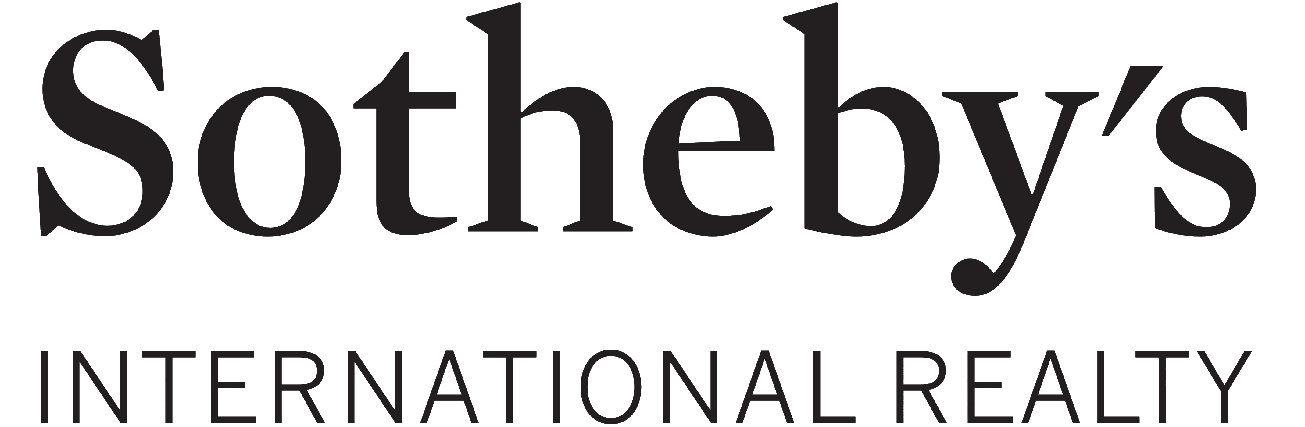
2. Sotheby’s International Realty: The gold standard for luxury. The elegant, custom serif font is instantly recognizable and communicates a legacy of prestige and trust.

3. Douglas Elliman: A bold, all-caps sans-serif wordmark. It’s authoritative, strong, and feels at home in a major metropolitan market like New York City.
Icon + Text
These logos pair a memorable symbol with the brand name.
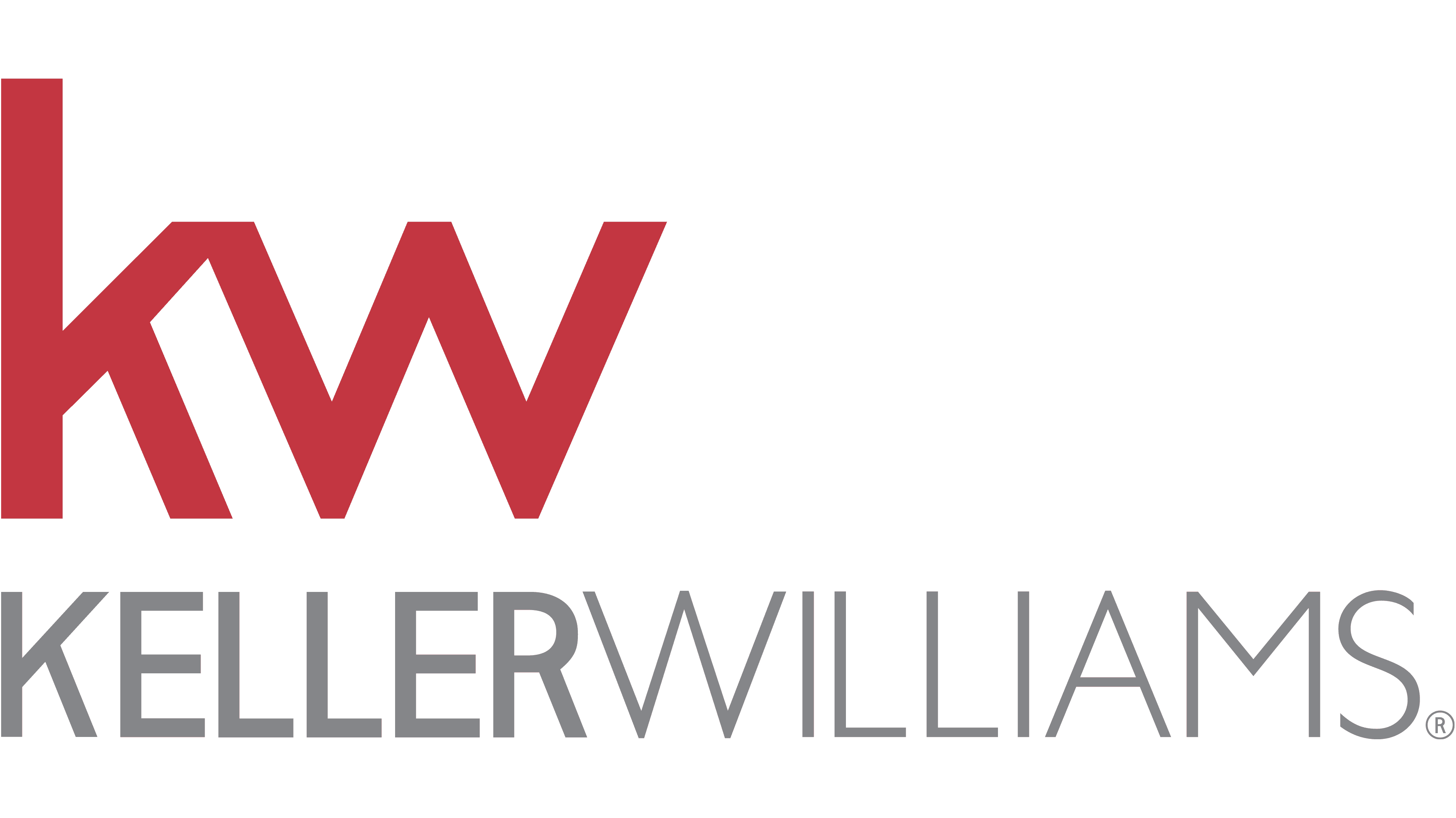
1. Keller Williams: The iconic “KW” monogram is simple, scalable, and instantly recognizable. It’s a classic example of a lettermark done right.
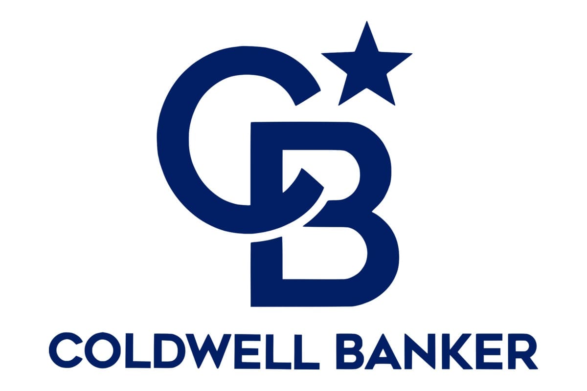
2. Coldwell Banker: The “CB Star” logo uses a star to symbolize guidance and quality. It’s a timeless mark that has been updated over the years to stay modern.
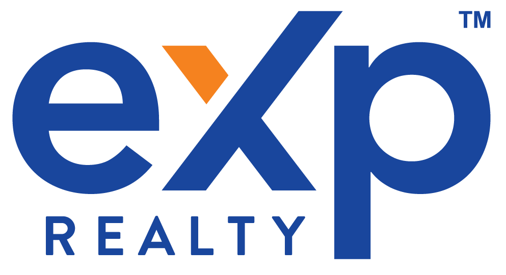
3. eXp Realty: The orange and blue logo with its forward-leaning text and stylized “X” feels dynamic and tech-focused, perfectly reflecting their cloud-based brokerage model.
Luxury / Minimalist
These logos prove that less is often more.

1. The Agency: A sleek, lowercase, black-and-white wordmark. It breaks all the traditional rules and in doing so, has become one of the most iconic brands in luxury real estate. It’s exclusive, confident, and effortlessly cool.
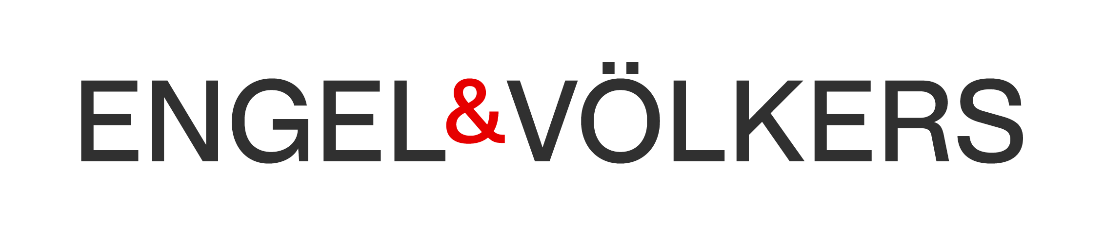
2. Engel & Völkers: The classic “E&V” monogram has a European elegance. The use of the ampersand as a central design element is a sophisticated touch.
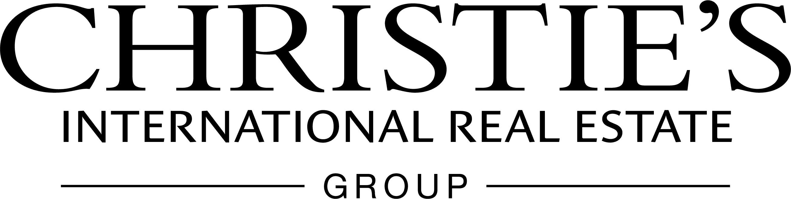
3. Christie’s International Real Estate: Leveraging the 250-year history of the Christie’s auction house, this logo uses a timeless serif font to communicate heritage, trust, and unparalleled expertise.
Local / Niche
These logos use iconography to signal a specific specialty.

1. Smith Mountain Homes: A literal icon that works. The mountain graphic integrated into the name immediately tells you their niche: mountain properties. It’s clear, effective, and memorable.
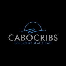
2. Cabo Cribs: The logo for this Cabo San Lucas brokerage is playful yet elegant, using a simple house icon with a wave to signal its coastal location.
Modern / Tech-Forward
These logos are built for the digital age.
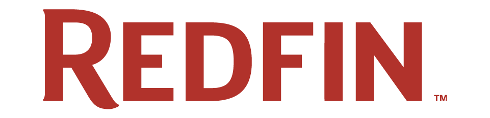
1. Redfin: The simple red pin icon is a perfect symbol for a map-based, digital-first real estate platform. It’s memorable, scalable, and directly tied to the user experience.
3 Common Mistakes to Avoid in Your Logo Design
- The Generic Roof Icon: This is the #1 mistake agents make. A logo with a generic roofline or key is instantly forgettable. It says nothing about you, your brand, or your niche. Avoid it at all costs.
- Using Too Many Colors or Fonts: A professional logo should use no more than two or three colors and one or two fonts. Anything more looks cluttered, amateurish, and will not scale well.
- Designing for Today, Not for Tomorrow: Don’t choose a logo based on a fleeting design trend. A great logo should be timeless. Think about the brands that have been around for decades. Their logos are simple, clean, and classic.
How Much Should a Real Estate Logo Cost?
The cost of a logo can range from free to tens of thousands of dollars. Here’s a realistic breakdown of your options:
- DIY (Free - $100): Using a tool like Canva, you can create a logo for free. While this is tempting for new agents, it’s a risky path. You are likely to end up with a generic design that won’t set you apart.
- Freelancer ($500 - $2,000): Platforms like Upwork or 99designs can connect you with freelance designers. This is a good middle ground, but the quality can vary wildly. You’ll need to vet designers carefully and provide a clear creative brief.
- Branding Agency ($5,000+): A professional branding agency will not just design a logo; they will develop a full brand identity, including your color palette, typography, and brand guidelines. For serious agents, teams, and brokerages, this is an investment that pays for itself many times over.
Your Logo is Your Legacy
Your logo is the cornerstone of your brand. It will appear on your business cards, your website, your social media, your listing signs, and every piece of property marketing material you create. It is the visual representation of your promise to your clients. By understanding the principles of design and investing the time and resources to create a professional, strategic mark, you are not just creating a graphic; you are building a legacy.
For more inspiration on building your brand, browse these real estate agent website samples to see how a great logo comes to life online, and check out these Real Estate Quotes to keep you motivated on your branding journey.